Our old nursery had a dropped ceiling and textured walls. When we took the ceiling down, there was nothing wrong with the ceiling but it did leave a design dilemma. Do we texture the rest of the walls up to the ceiling or leave it as is? Since I was in no mood for more work, "leave it alone" became my mantra, along with "I need more chocolate, NOW!"
We painted the ceiling yellow and the walls a sage green because back then no one found out what was cookin' in the oven, so neutral colors it was.
As much as I liked the color scheme, I did not like that the walls looked unfinished with the two colors. But baby #1 was born and it stayed like this for a while.......then one night while nursing him in a blurry fog I came up with an idea.
Blurry, sleep deprived fogs are sometimes when inspiration strikes apparently. I mean, your mind is free to wander wherever as you try to keep from dropping the baby from your lap and/or drooling on the poor thing as your mouth lays gaping open. And forget the whole changing the diaper at 3am. I am surprised my children survived the first year.
So, as I was gazing at the ceiling trying to stay awake, I must have thought, "why not make a border out of all the baby pictures I take!" I could not possibly afford all of the albums it would take to house all of the pictures I had taken and I like to look at them and smile so this is how it went down, or up as is the case here.
These pictures are from 2002 and I had to scan them in so I apologize that the quality is not good but it will give you the idea.
Actually if you look real close, it was exactly 4/30/2002. So now if someone asks, I can say I know exactly one thing I was doing on that date. Taking a picture of pictures. Sounds odd but that is my life.

I went through all of the pictures I had taken thus far and chose a mix of horizontal and vertical as it looks a bit better to me.
The idea is that there will be a progression in age as you add more pictures. So as your baby grows so does your border. Kinda cool.
Just an FYI, after you fill your four walls, your baby continues to grow. Your on your own for figuring out how to document from there on.
After I picked the pictures that I wanted, I copied them at Kinkos into black and white. I love B&W photos and it really made it look more uniform than the color photos. But do what you like, it's your nursery!
I originally decoupaged the first 3 photos to the wall and then realized, "what happens if we move?!?" Which seems to be our modus operandi , as soon as we get the house how we want, we move. Any body else smellin' what I'm cookin'?
So....

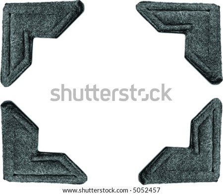
I bought those little black picture mounting corners and put them on the corners of the remaining pics. And added them to the first three decoupaged pics for continuity's sake.
I layed them out on the floor to see how I wanted them and the just started hanging.
Every time I would walk in the room or pass it in the hallway, I'd have to stop and take a look. The pictures just made me smile. And that is a good thing.
What do you think?
Always being renewed,


I love all your ideas for redesigning "whatever you have: Everything is so adaptable for anyone to do. I am not good with original ideas but I can work them up if someone shows me how. Thanks, Kim, for these great thrifty ideas. Cathy
ReplyDelete